
Customization of the layout of your public site runs through SparqFest site themes. A site theme defines the layout of your public site and your general ability to control the look and feel through custom colors and fonts. Unless the theme documentation says otherwise, each theme will support all SparqFest functionality. The theme simply governs how your audience interacts with that functionality.
What's in a theme?
Each theme is a set of templates for the page of your site with options for you to customize colors, fonts, and sponsor placements. Each theme takes a different approach that reflects different kinds of festivals. The currently available themes are:
To change your theme, you will need to go into the Staff Portal and navigate to the Basic Info tab in the Web Site subsection of the Settings section ("Settings" > "Web Site" > "Basic info"). The first field is a drop-down box with the themes currently available to you.
After you change the theme, it will take some time (up to an hour) for the system to rebuild your site and refresh caches throughout the network.
Would you like an entirely custom design?
We offer services for an additional charge for designing and implementing custom themes. Contact our sales staff for an estimate.
Color Customization
Each theme has its own rules for what colors you may customize. No matter what theme you are using, however, we will ask you for the following colors:
- Light Brand Color (along with a contrast color)
- Dark Brand Color (along with a contrast color)
As the names imply, the light brand color should be a "lighter" color than the dark brand color. Ideally, the light brand contrast color is simply the dark brand color (and vice versa). If, however, your light and dark brand colors are too close together, you may need to introduce special colors for the contrast color. A "contrast color" is one that contrasts well with the other color. For example, text in the "light brand contrast color" should be easy to read when placed on a background of the "light brand color".
Individual themes may ask for additional colors for special scenarios. Each color has help text that describes how it is used. On occasion, you may see error messages saying "Color X does not provide enough contrast with Color Y." If "Color Y" is a dark color, that means you need to make "Color X" lighter for the system to accept it. The opposite is true if "Color Y" is a light color.
Selecting the Right "Brand Colors"
As mentioned above, every theme asks for your brand colors and something to contrast with those brand colors. When you worked on your festival brand, you probably picked out at least two core colors that are likely present in your logo. If the brand was professionally created, then the two core colors almost certainly contrast with each other (readable when one is the background and the other is foreground). That's not always the case, however.
Another common approach to brand colors is "edition-specific" coloring. In other words, you alter your color scheme each year to reflect a theme.
Need help with your color palette?
The ColorKit web site has an online tool for generating color palettes. If you simply have no color palette, you can play with it to randomly generate the right color palette for you. You can also have it generate a color palette based on an image or using a specific color as a seed color.
Whatever your approach, you will want to select two colors that help identify your festival to your audience. While they do not need to contrast with each other, ideally they do. The following example shows how Minnesota WebFest selected colors.

The Minnesota WebFest Logo
The logo for Minnesota WebFest was designed by an ad agency and came with a brand style guide. The turquoise represents the 11,000+ lakes of Minnesota and the purple represents Minnesota culture (purple is ubiquitous in Minnesota arts and sports). This is the easiest scenario for selecting colors as the style guide should specify directly what colors are your light and dark brand colors (more specifically, it should define your brand colors and you select the one most appropriate for the light color and the one more appropriate for the dark color).
Even if we didn't have a style guide, the logo itself serves as the guide. The turquoise would be the light color and the purple the dark color.
WARNING: You may be tempted to use a light color for the "Dark Brand Color" or a dark color for the "Light Brand Color". For example, a theme may heavily use the light brand color in backgrounds when you'd prefer it to use the dark brand color. Do not do this, as it may have unintended side effects elsewhere.
What if you don't have a style guide and your logo is monochromatic? Our typical approach in this situation is to look at the festival's main web site and pull colors from that color palette. If the color palette itself is fairly bland, another good approach is to pull imagery from the site and select two contrasting colors from that imagery.
Selecting the "Contrast Colors"
If many cases, the simplest approach to contrast colors is to use the dark brand color as the light brand contrast color (and vice versa). Sometimes, however, your dark and light colors do not provide enough contrast with each other. That's OK. That's why we allow you to configure your contrast colors.
The contrast colors should "compliment and contrast". In other words, they should provide enough contrast to be legible when the contrast color appears as text on a background of the brand color but they should also look good. If you have a style guide, the style guide should have more than two colors and often it includes examples of good contrasting colors for this purpose.
Absent a style guide, you should use the tool mentioned above or simply experiment.
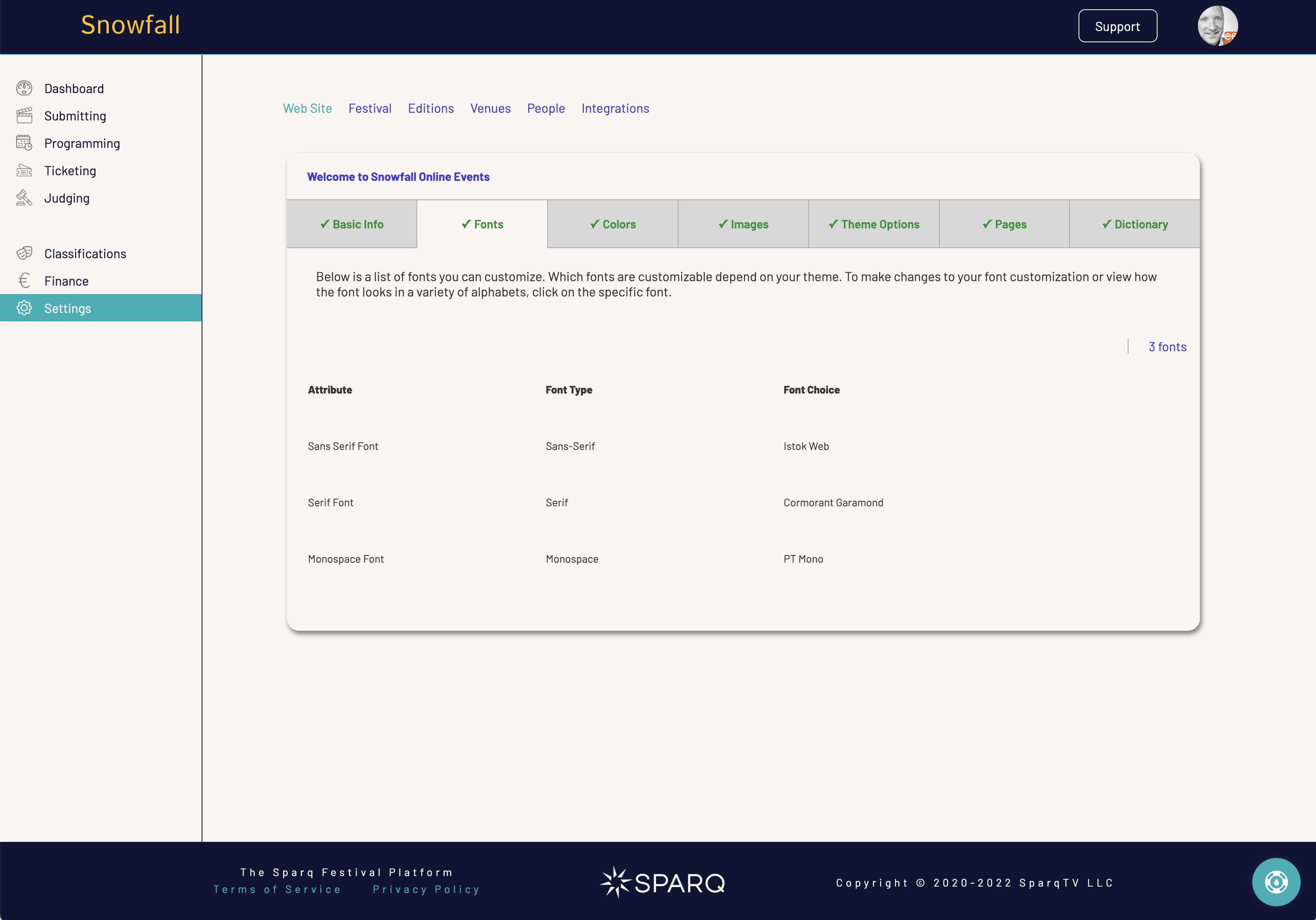
Font Customization
Each theme has a default set of fonts for sans-serif, serif, and monospace contexts. If you like this default font, then keep it. You may, however, customize your site with any font you find from Google Fonts.
Understanding Fonts
If you are not familiar with fonts, here's a quick guide to understanding the different kinds of fonts and how they are generally used within SparqFest themes.
A sans-serif font is the most common font you will see in online content. It lacks the little decorative items you will see in serif fonts. This is the font you are most likely going to want to customize. When searching Google fonts, you can limit your search to only sans-serif fonts. Example: "the quick brown fox jumped over the lazy dog".
In contrast, a serif font is a "fancy" font with decorative elements. It is most commonly used in print as serif fonts are generally easier for people to read. SparqFest themes use serif fonts only in very limited contexts to highlight certain kinds of content. Overuse of a serif font can make a site look more like a book than a web site. Example: "the quick brown fox jumped over the lazy dog".
As the name implies, a monospace font is one in which the amount of space taken up by each letter is the same. With serif and sans-serif fonts, different letters will occupy different amounts of space (think "i" vs "m"). SparqFest typically uses monospace fonts to call out special technical information. Hashtags, for example, are almost always displayed in a monospace font. Example: "the quick brown fox jumped over the lazy dog".
Customizing fonts is really not necessary unless you have a special font you typically use in your print materials or on your main web site. Because we currently support only Google Fonts, it is likely they we won't have an exact match (unless your font happens to be a Google Font). Minnesota WebFest is a good example of this in play. The main font for Minnesota WebFest is a font called "Futura". It is not a Google Font. Instead, we performed a search on "Google fonts like Futura" and came up with "Jost" as a suitable stand-in.
Typically, it does not make any sense to customize the serif and monospace fonts. The defaults for each theme are selected to look good for that theme, and few brands have defined serif and monospace fonts. If, however, your festival brand has specific serif and monospace fonts, you should definitely feel free to customize these values.
How to Add a Google Font
In the Fonts tab under Web Site settings, you will see a list of different font attributes you can configure. The list depends on your choice of theme. Select any attribute to make changes. Under most themes, the font you are most likely to want to configure is the “Sans-Serif” font.
When you select a font, a dialog will open that enables you to see how that font will look in a variety of contexts and, if you want, to change the font.
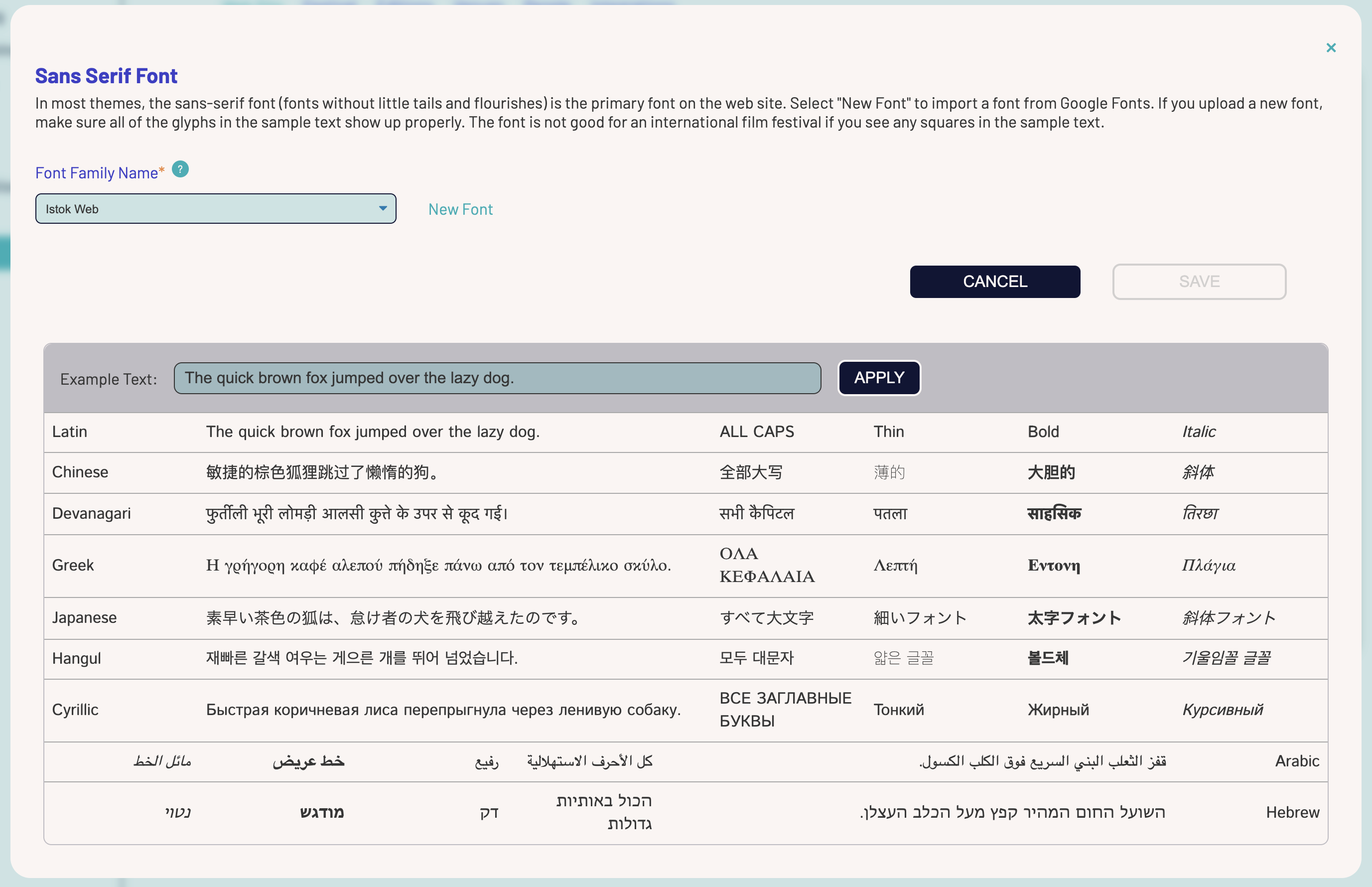
The font dialog shows a dropdown at the top where you can change to another built-in font or enter the name of any Google font.
Below the Cancel and Save buttons is a section that allows you to see exactly how that font looks across different writing systems and formatting options. It also allows you to enter some text in your own language and see how that specific text looks translated into languages that use the sample writing systems.
What are you looking for?
Your creators can upload works with titles in any language that has ever existed. This page gives you an idea of how a given font will appear when you have a selection using one of the sample writing systems. Just because a writing system is not shown in this dialog does not mean it is not supported. We simply selected a list of the most common writing systems. Chances are that if your font looks good in these systems, then it will also look good in less common writing systems.
If you see boxes instead of glyphs, your font choice may have issues for international content.
Some fonts also look terrible in thin, bold, or italic. The documentation for your theme will note any font concerns specific to that theme. While most SparqFest themes rely in a very limited degree on thin, bold, and italic variants, some themes may rely on a specific variant more than others. The Renaissance theme, for example, makes heavy use of thin variants. Selecting a font with an unreadable thin variant is bad for that theme.
If a sans-serif font appears serif in another language, it is also probably not a good selection.
You should not worry as much about serif fonts that look sans-serif in other languages. In addition, monospace fonts are almost always used to show content using the Latin alphabet (ABC etc) and Arabic numerals (123 etc) . The quality of a monospace font covering other characters is likely unimportant.
You can switch what font is being presented in this dialog by switching the selection in the “Font Family Name” dropdown. If you like one of the built-in fonts, click “Save” to make that font permanent.
We also support the ability to use any Google Font. To use a Google Font, first, find your font on the Google Fonts site.
Once you have found the ideal font, go back to SparqFest and click "New Font". You need enter only the name of the desired font. Please read any license restrictions for your font of choice to make sure you will have the proper rights to use it on your site!
The new font will be selected and the text below will appear in that font. If you like the font choice, click "Save" on the main form to make the changes permanent.
Sponsorship Placements
A full discussion of how themes interact with sponsorship placements is beyond the scope of this document. Nevertheless, each theme comes with a variety of options for how different sponsors may be reflected on your site. The documentation page for each theme will include information about the sponsorship placement options associated with that theme. You must currently contact SparqFest support to get your sponsors added to the system.