Customization Effort: High
Profile: Hybrid festivals wanting to promote online screenings
Cautions: See notes on using custom fonts with this theme
The Renaissance theme is a return to basics. It is a redesign of the original look and feel of SparqFest web sites with a 2020's style. Like other themes such as Festflix and Mediterranean, it provides access to all SparqFest features. The focus, however, is the online screening block.
Like the original SparqFest design, Renaissance is heavily customizable in terms of color scheme.

The Renaissance home page
Colors
As with all themes, you must define light brand and dark brand colors as well as contrasts. In addition, Renaissance supports a number of customizable colors:
- Navigation Background - the color of the navigation background on all pages
- Navigation Text - the colors of the text in the navigation bar on all pages
- Home Carousel Background - the color of the background of the carousel on the home page
- Home Carousel Text - the color of the text inside the home page carousel
- Footer Background - the background color for the footer on each page
- Footer Text - the text color for the footer on each page
- Button Background - the background color for buttons (when enabled)
- Button Text - the text color on buttons (when enabled)
- Titles - the color of titles on the pages
- KB Color - the color of the KB widget
The colors configured for the demo site shown in the screenshots are:
- Dark Brand Color: Dark Blue
- Light Brand Color: Silver
- Dark Brand Contrast Color: Silver
- Light Brand Contrast Color: Dark Blue
- Navigation Background: Dark Blue
- Navigation Text: Silver
- Home Carousel Background: Silver
- Home Carousel Text: Dark Blue
- Footer Background: Dark Blue
- Footer Text: White
- Button Background: Dark Red
- Button Text: White
- Dark Links: Light Blue
- Titles: Dark Red
- KB Button: Dark Red
Choosing Fonts for Renaissance
The default font with this theme is Josefin Sans, which displays nicely in thin and light variants as long as you have a strong contrast between your text and background. If you opt for a custom font, you should select one that has a good thin and light variant.
To get any idea for how a font will look at a lower font weight, preview the font in Google Fonts with the font weight set to “Thin 100” (the default is “Regular 400”). In particular, have a look at the 16px preview. If it doesn't look good in the Google Fonts preview, it definitely won't look good with this site theme.
Pages
Renaissance does not introduce any unique pages. This section, however, provides examples of what you can expect each page to look like. Actual pages naturally depend on how you have configured the theme and what content has been uploaded.
Common Elements
All pages share a footer template. In addition, the header is the same for every page except the home page. On child pages, the header appears in a black band across the top and includes the main site menu. On the home page, the header has a transparent background and sits overlayed on top of your welcome banner/video. The main site menu is not in the header, but instead below the welcome banner/video.
Inside the header, there are placements for your top-level sponsor. All sponsors of this type appear on every page of the site without any rotation.
The footer includes all of your social links as well as links to the SparqFest creator, judge, and staff portals. If your site is configured for multiple languages, a language preference option also appears in the footer.
What items appear in the main menu depend on what content you have uploaded and what stage your festival is at. The "Ticketing" link, for example, shows up only when you have tickets to sell. If your festival is not using our ticketing or your festival dates have passed, that link will not be live.
Possible links are:
- Tickets - a link to the ticketing page
- Official Selections - a link to the list of Official Selections
- Events - a link to all non-screening events
- Screenings - a link to a list of all screenings whether virtual or in-person
- Venues - a link to a list of venues for the current edition of the festival
- Merchandise - if you have configured merchandising, a link to your merchandising site
- Full Schedule - a link to a full schedule of the festival structured as a calendar
In addition, once logged in, a user can access the following pages:
- User Profile Page - manage preferences and payment information
- Watch List - manage favorited selections and quick access to previously watched content
- Audience Choice Voting - page for participating in audience choice voting
Finally, the following pages are child pages to some of the above pages:
- Selection Page - all content we have collected from a specific selection
- Event Page - information about a specific event or screening
- Venue Page - information about a festival venue
Home Page
The home page has a different header and main menu than all other pages under this theme. The welcome banner/video is the primary content on the page with the navigation below the banner. Festival dates show in a footer that sits permanently at the bottom of the visible screen.
The welcome banner is the default content and is required even if you provide a welcome video. This welcome image comes from the configuration for the current edition of your festival. If the current edition is in the future or in progress, it will show the configured welcome banner. If, on the other hand, the current edition has passed, it will show the post-festival banner. Both are configured in the Staff Portal under "Settings" | "Editions" | [Current Edition] | "Graphics".
The home page also supports a welcome video that loops silently on top of the welcome banner (thus hiding the welcome banner). Configuration of the welcome video also occurs in edition settings under the “Videos” tab.
Welcome Banner Requirements: 1940x692 JPG, PNG, or WebP image
Post-Festival Banner Requirements: 1940x692 JPG, PNG, or WebP image
Welcome Video Requirements: H.264 MP4 video at 1940x692
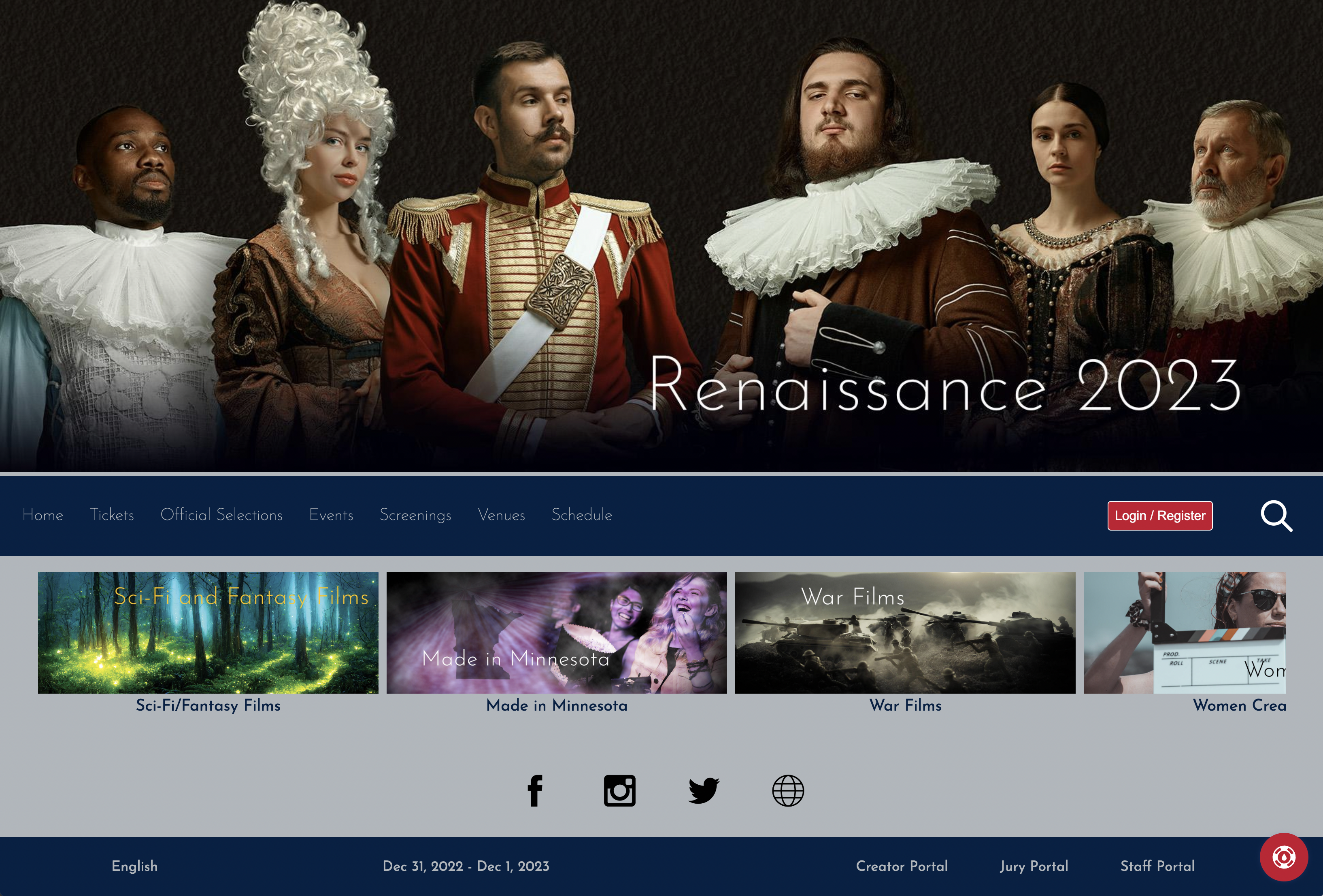
An example of the Renaissance home page
Below the welcome banner/video is a "carousel" for online screenings. If you do not have any online screenings, there is no carousel. Access to all other festival events comes through the “Screenings” and “Events” menu items (no events are configured in the example festival above).
Ticketing Page
The ticketing page is available on the site only if you currently have tickets to sell. Otherwise, the menu is hidden.
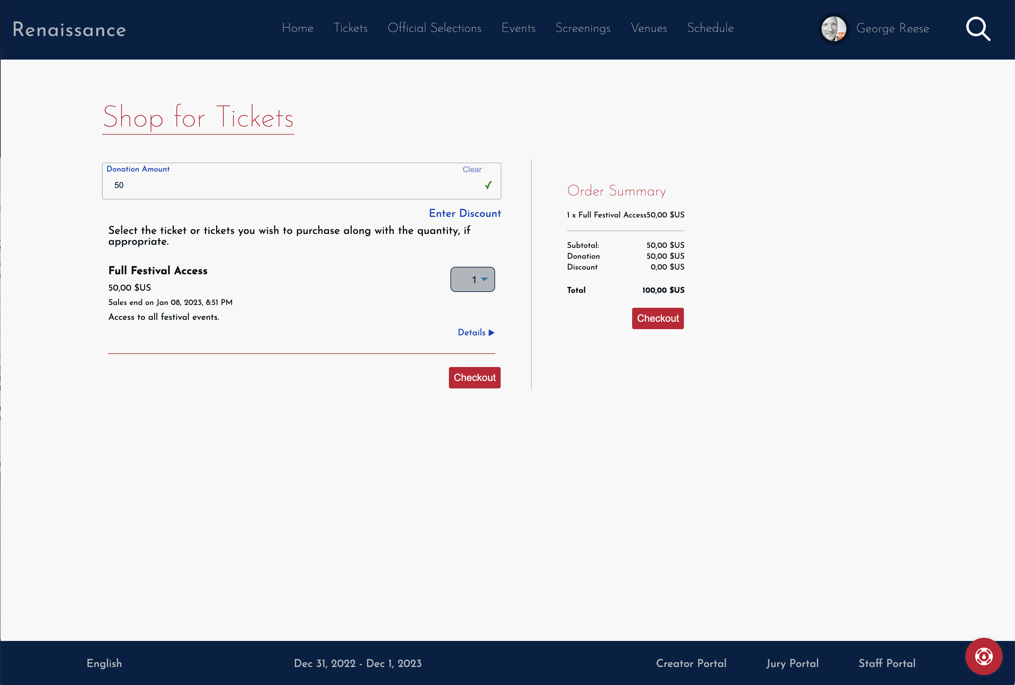
An example of a Renaissance Ticketing Page
Note: The browser in the above example is configured with a "comma" as a decimal separated as is common in Europe.
As you would expect, the ticketing page lists all available tickets and enables the audience to purchase tickets. A common design for child pages under the Renaissance theme is the title at the top of the page with the body below.
In the case of the ticketing page, the main content is the list of tickets from which users may select. When a quantity is selected for a ticket, the purchase information on the right is updated. Up at the top, the user has the ability to enter a discount code as well as donate to the festival if you have configured your festival to accept donations.
Official Selections Page
The Official Selections page enables visitors to see all Official Selections that have uploaded sufficient information. As you might expect, a selection appears on this page only if "publicize selections" is enabled for the edition of the festival with which it is associated.
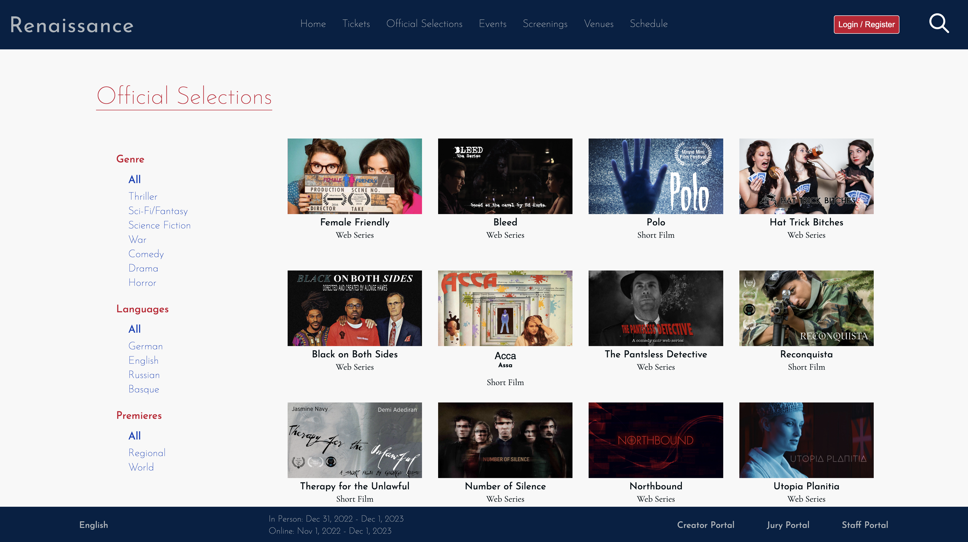
The Renaissance Official Selections Page
When you go to this page, it not only lists the selections, but also lets you filter the list. What filters are available depend on how you have configured the festival in the festival settings area of the Staff Portal. For example, this festival has enabled the "promote genres" and "promote languages" settings. That means users can filter by genre or language. In addition, if you have been with us through multiple editions of your festival, people can see an archive of old selections.
Filters that always show (if relevant): edition, premiere
Filters you configure: genre, perspective, theme, language, and country.
Each selection shows its poster and the title. A user can click on the selection to get to the main page for that selection (aka the selection page).
Selection Page
Each Official Selection receives its own "Selection Page". The selection page enables the visitor to see all the information we have collected on the selection and, if allowed, view the selection "on-demand".
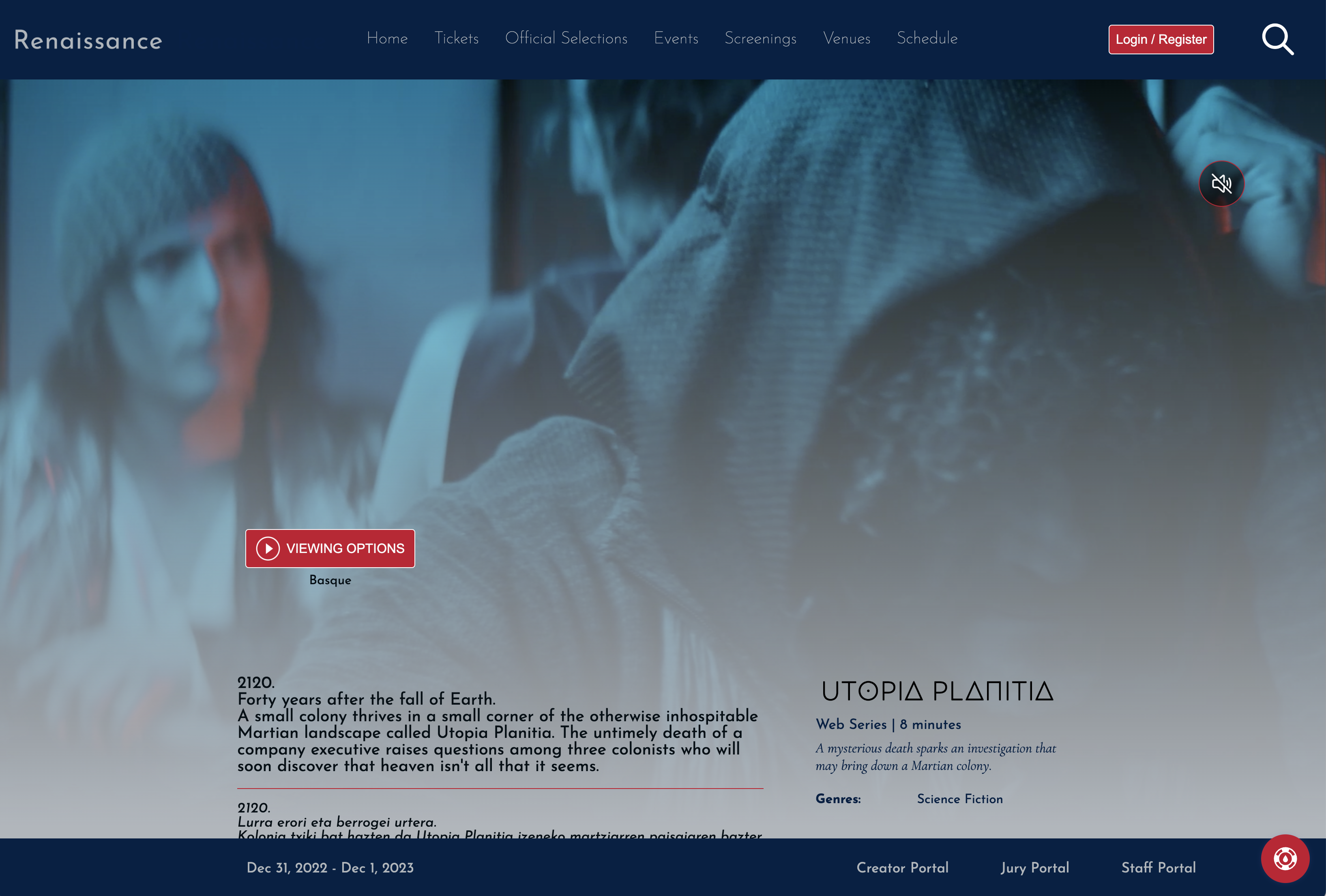
"Utopia Planitia" as represented in the Renaissance theme
The example above highlights some of the aspects of how we handle selections in a language that differs from the user's configured language. If the user had been configured for Basque and the site supported Basque, this page would have shown up entirely in Basque with no English content. This site, however, neither supports Basque nor is the user logged for this example configured for Basque. Nevertheless, because the selection is a Basque language selection, the page includes the original Basque language synopsis in addition to the English synopsis. Both the Basque and English titles are generally provided as well. In this case, however, the title is the same in Basque and English (Utopia Planitia actually Latin), so the title displays just once.
The main area of the selection page contains project's poster with critical information about the selection, including how people can watch the selection. After the page loads, any trailer configured for the selection will automatically play (silently) over the selection poster while still allowing the user to interact with all content. They also have the ability to unmute the trailer and watch it.
NOTE: We recommend all filmmakers upload 1920x1080 trailers for the best look on this page.
Events Page
The events page lists all non-screening events. In other words, the events page will list both live streams as well as all in-person events EXCEPT in-person events with an event type of "Screening".
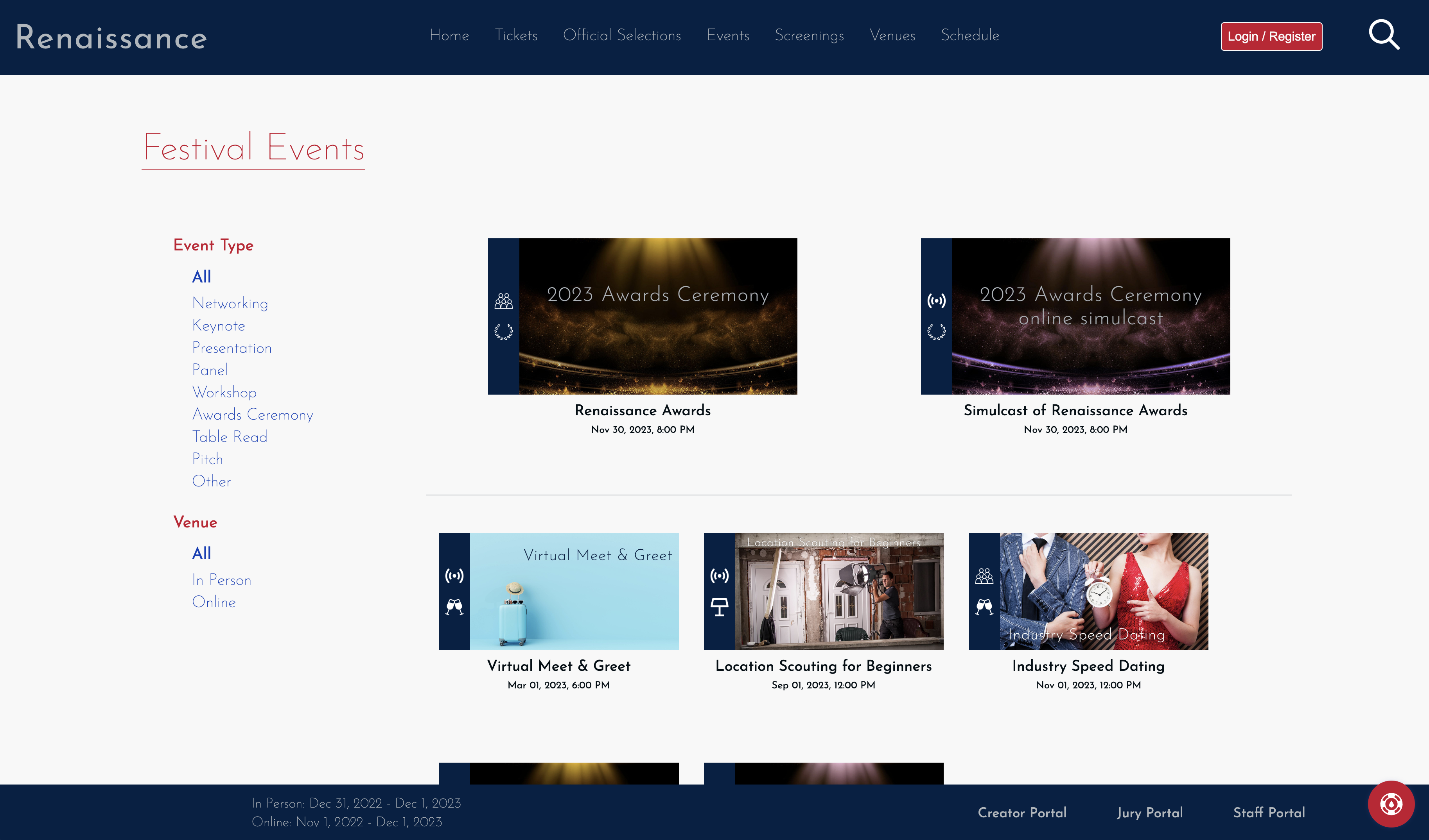
The Events page highlights your awards ceremony and the next event
The top part of the page highlights up to two events. One will be the awards ceremony (in-person if one exists, otherwise the virtual one) and the other will be the next scheduled event. If you have no awards ceremony in SparqFest, only the next event will appear. If all events have already taken place, there will be no highlighted events section.
The rest of the page contains the full list of events ordered by start time with past events moved to the end of the list. Viewers can see at a glance what kind of event each event is, as well as if it is in-person or online. Each event naturally links to its full event page.
Event Page
The event page is the official home for each event, including screening blocks and in-person screenings.
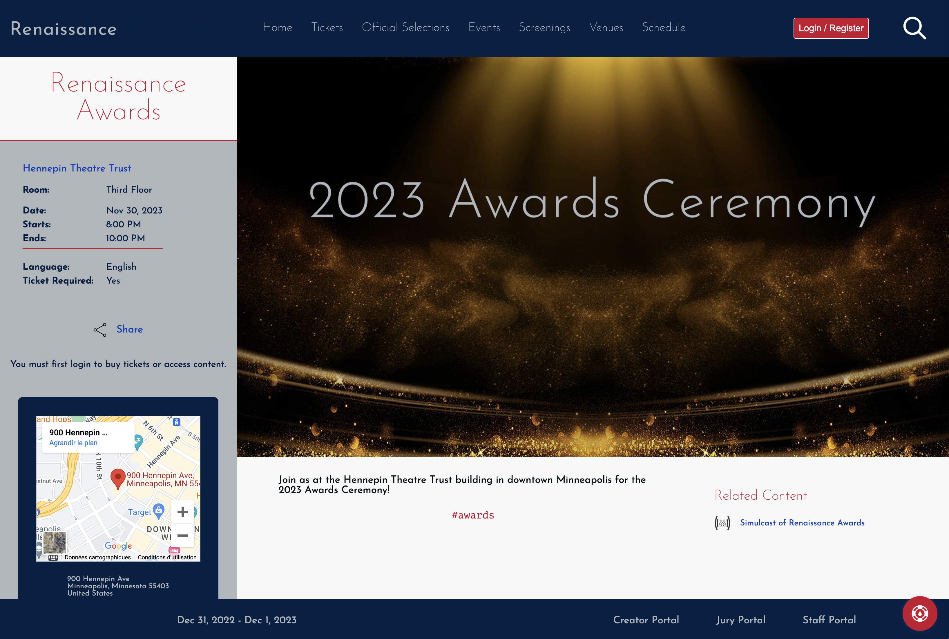
An example of the Renaissance event page for an awards ceremony
The event page contains all information you have provided about the event, including links to the venue, a map showing the location, and any related content like a live streamed simulcast. Visitors can purchase tickets to attend the event straight from this page. Because the user in the screen shot above has not logged in, there is a message that a login is required to purchase tickets.
Coming soon: venue weather
Live Streams
Live streams differ from what is shown above in that there is obviously no venue map and visitors are provided with a real time glance at how much time remains until they can join the live stream. Once the lobby for your live stream opens, a "Join Now" button appears on the page that allows them to join the live stream.
Screenings
Screenings show the full program of selections for the screening event. In-person screenings provide a venue map whereas online screening blocks do not.
Screenings Page
The screenings page lists all screenings associated with your festival. Both screening blocks and in-person events of type "Screening" are listed here.
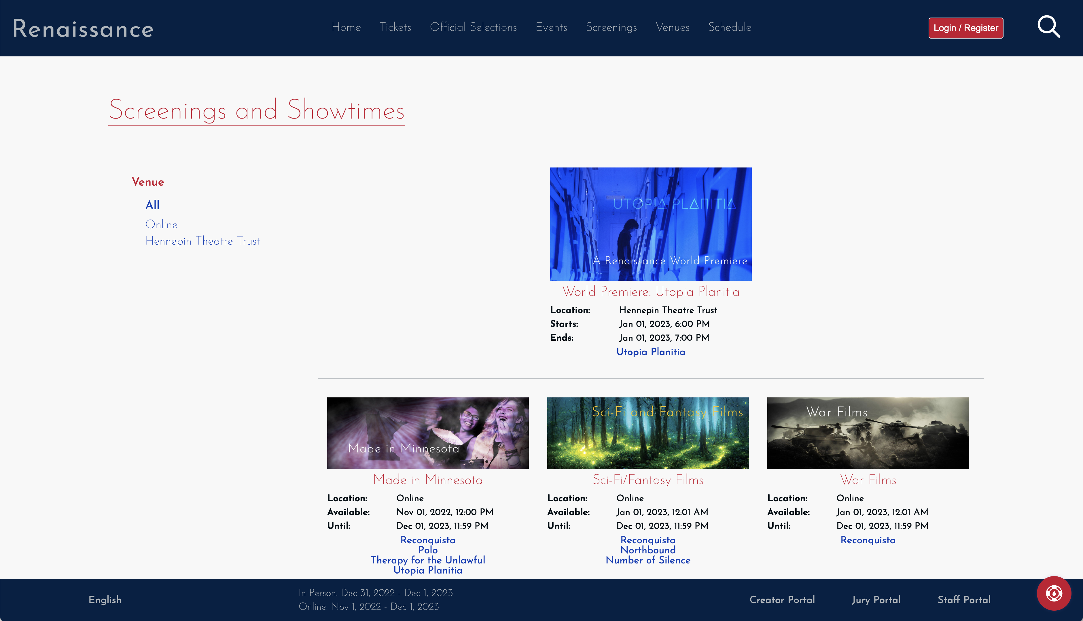
We Renaissance screenings page enables you to filter by venue
On the left hand side is a list of venues. By default, the page shows all screenings. Users can select a specific venue or “online” to filter screenings by venue.
At the top of the page are any highlighted screenings, if relevant. A screening is highlighted if it is a premiere of any sort, with priority given to world premiere screenings.
Each screening on the page shows the full program and show times. Times for online screening blocks are in the visitor's time zone and times for in-person blocks are listed in the venue time zone.
From this page, the visitor can click through to the event page for the screening as well as the individual selection pages.
Venues Page
The venues page provides a listing of all venues associated with the current edition of the festival. Simply adding a venue in the Staff Portal will not make it show up here. The venue must be associated with an event tied to the active edition of the festival.
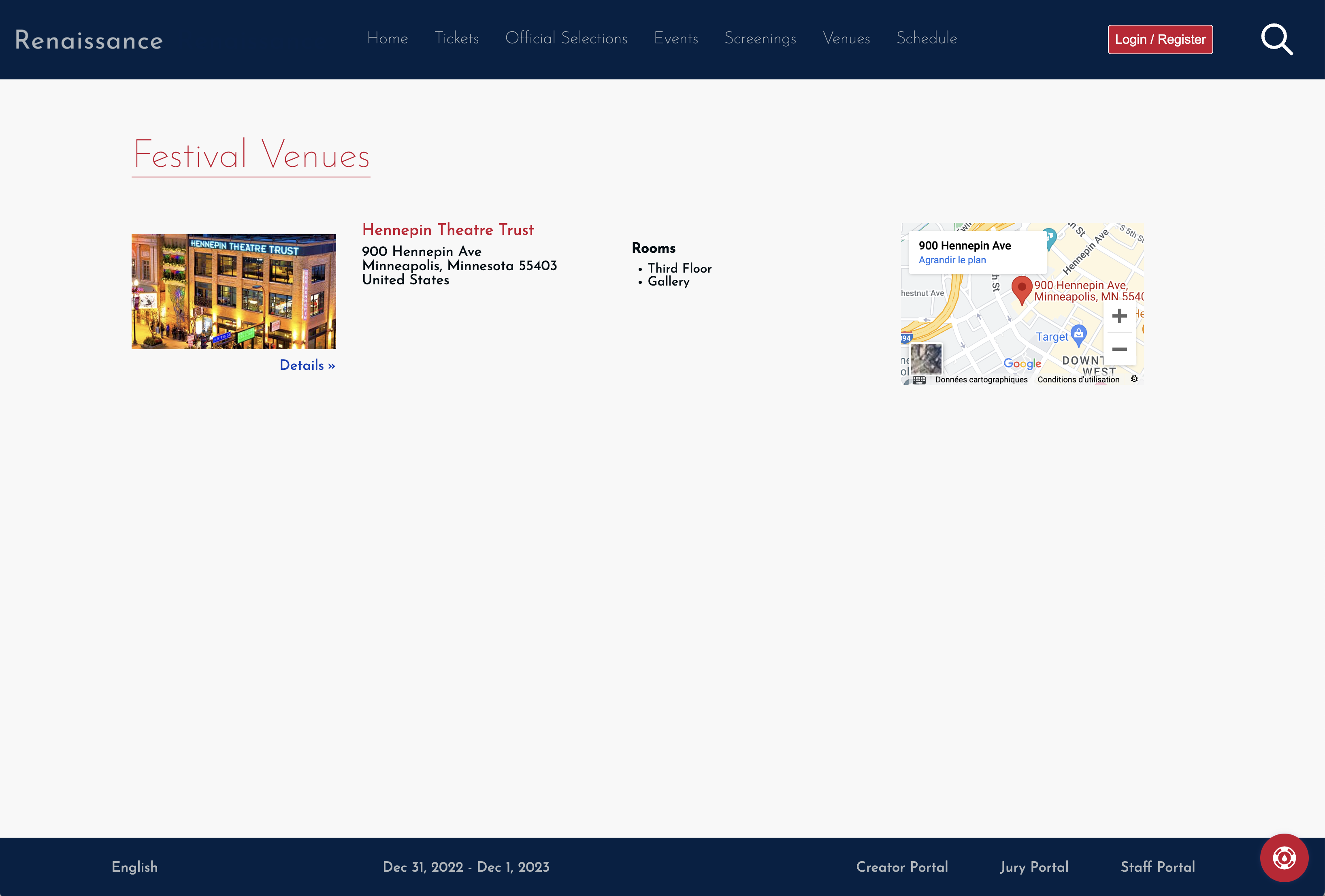
The Renaissance venues page gives quick access to venue information
Each venue appears with a link to Google Maps for the venue and the venue's venue page. If the venue has rooms associated with it, this page will list all of the rooms.
Venue Page
The venue page shows the details you have provided for each venue.
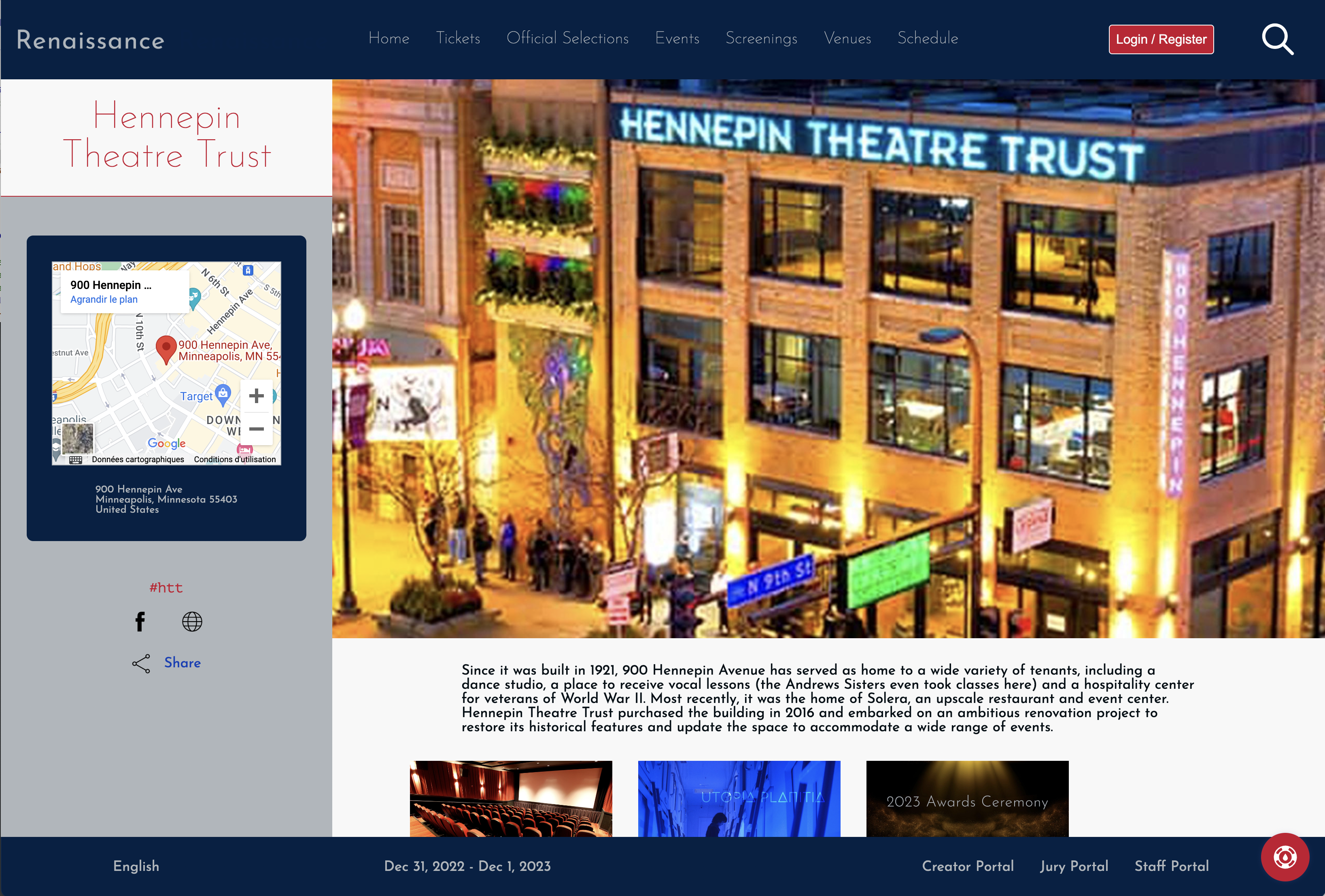
The venue pages feature your festival venues
Visitors get quick access to everything important about a venue, including a map and what events are taking place at the venue.
Merchandise Page
Currently, the merchandise page is an external page you host or from a third-party like Shopify. In the future, we intend to add built-in merchandising capabilities and this theme will support that functionality when added.
Full Schedule Page
The schedule page enables visitors to get a look at the full festival schedule.
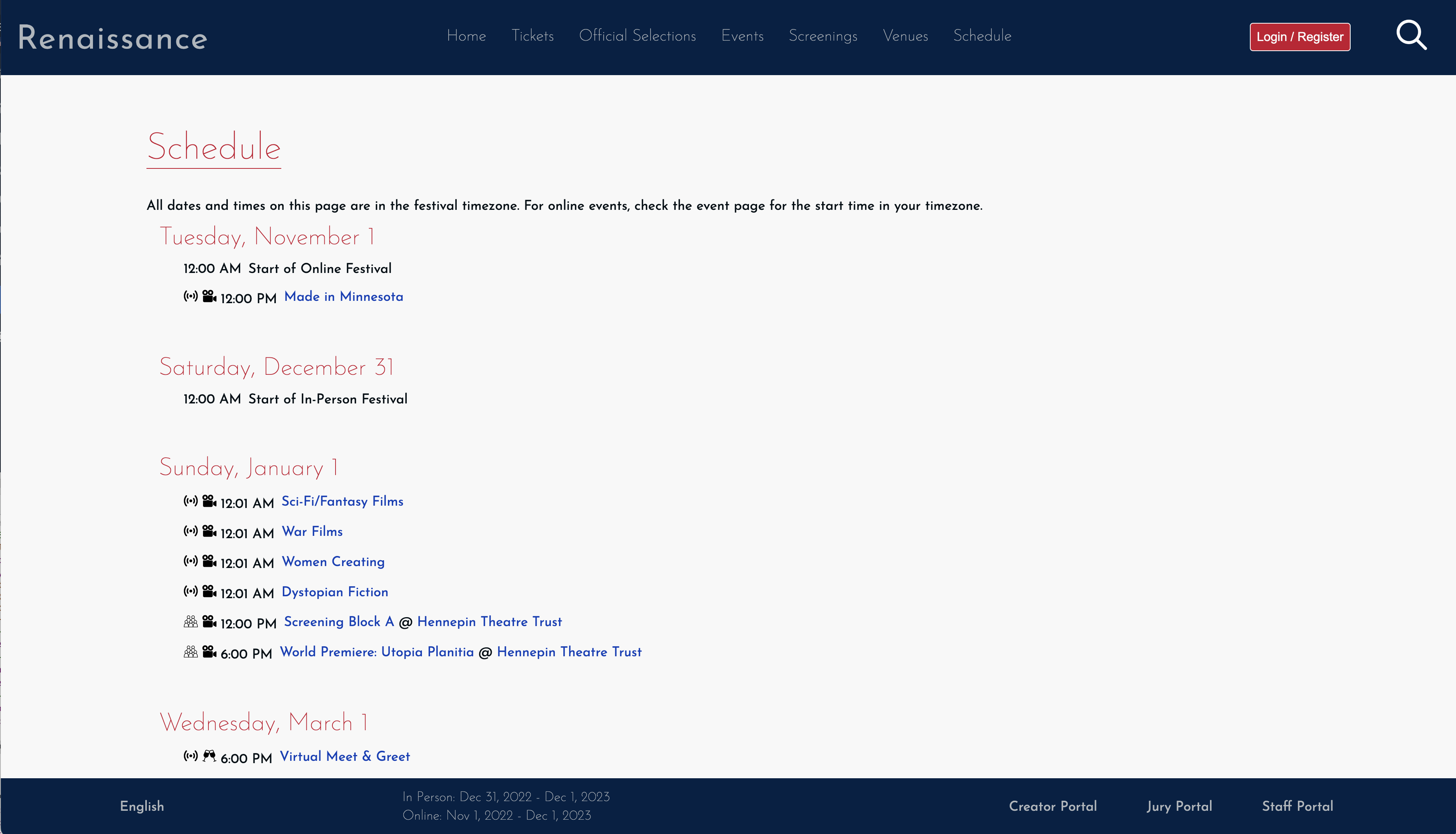
The schedule page shows each day of the festival with the events scheduled to start that day.
Each day of events from festival start until the end appears in order on this page (except for days that have no events). Each day shows every event for that day along to links to the event page and the venue page for that event. Icons show what kind of event it is and whether it is an in-person event or online event.
User Profile Page
The user profile page is where authenticated users manage their account with your festival.
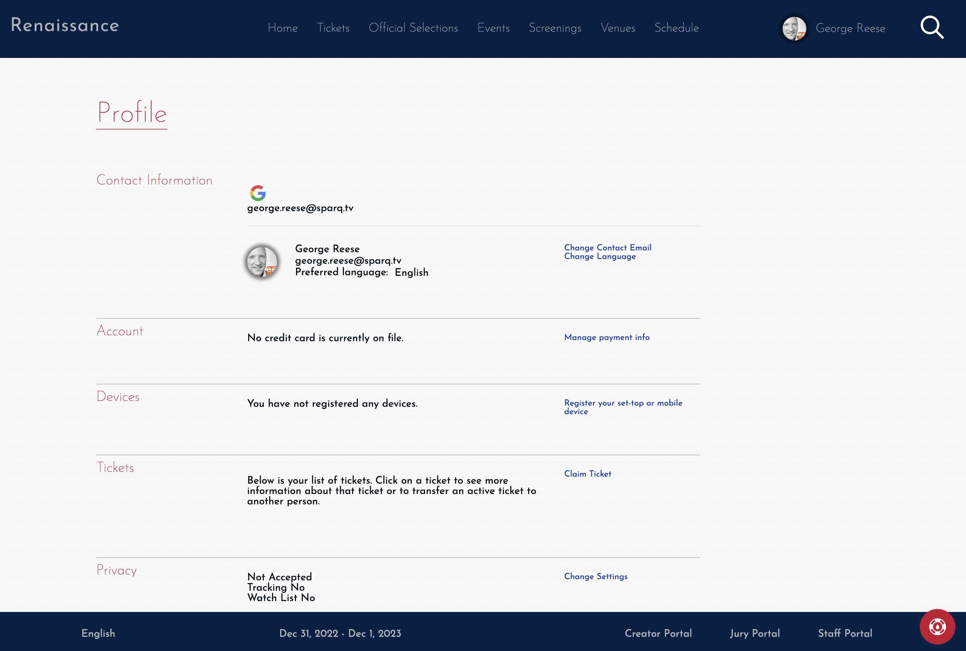
User's manage their personal information on the User Profile Page
This page enables a visitor to transfer tickets, change their contact information, manage payment methods, view device registrations, and control their privacy settings.
Watch List
Visitors have the ability to "favorite" individual selections. In addition, we keep track of everything they have been watching. The watch list page provides them with access both to their favorite selections and everything they have been watching previously.
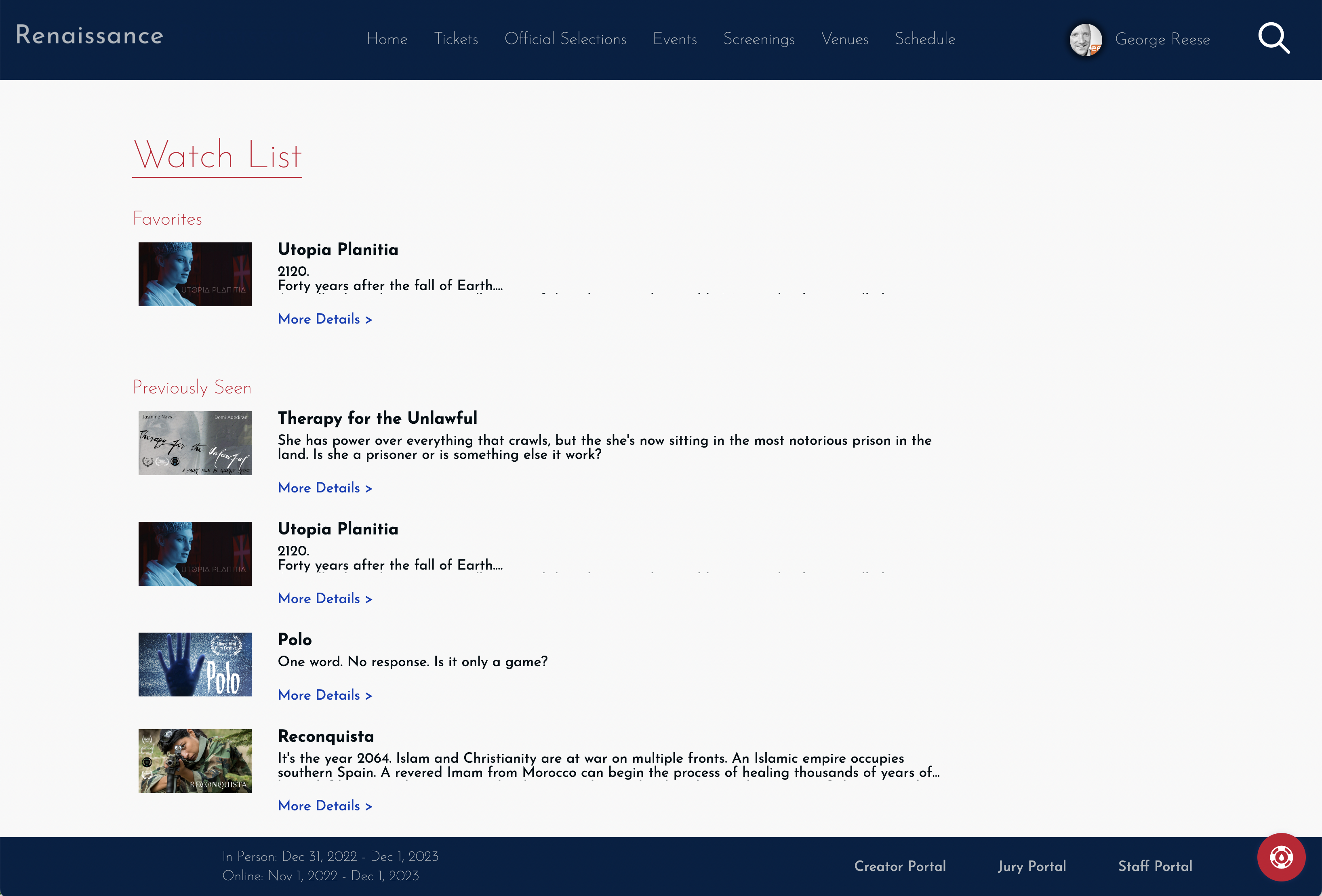
A Watch List page from the Renaissance site theme
Audience Choice Page
The audience choice page is where your audience goes to vote.
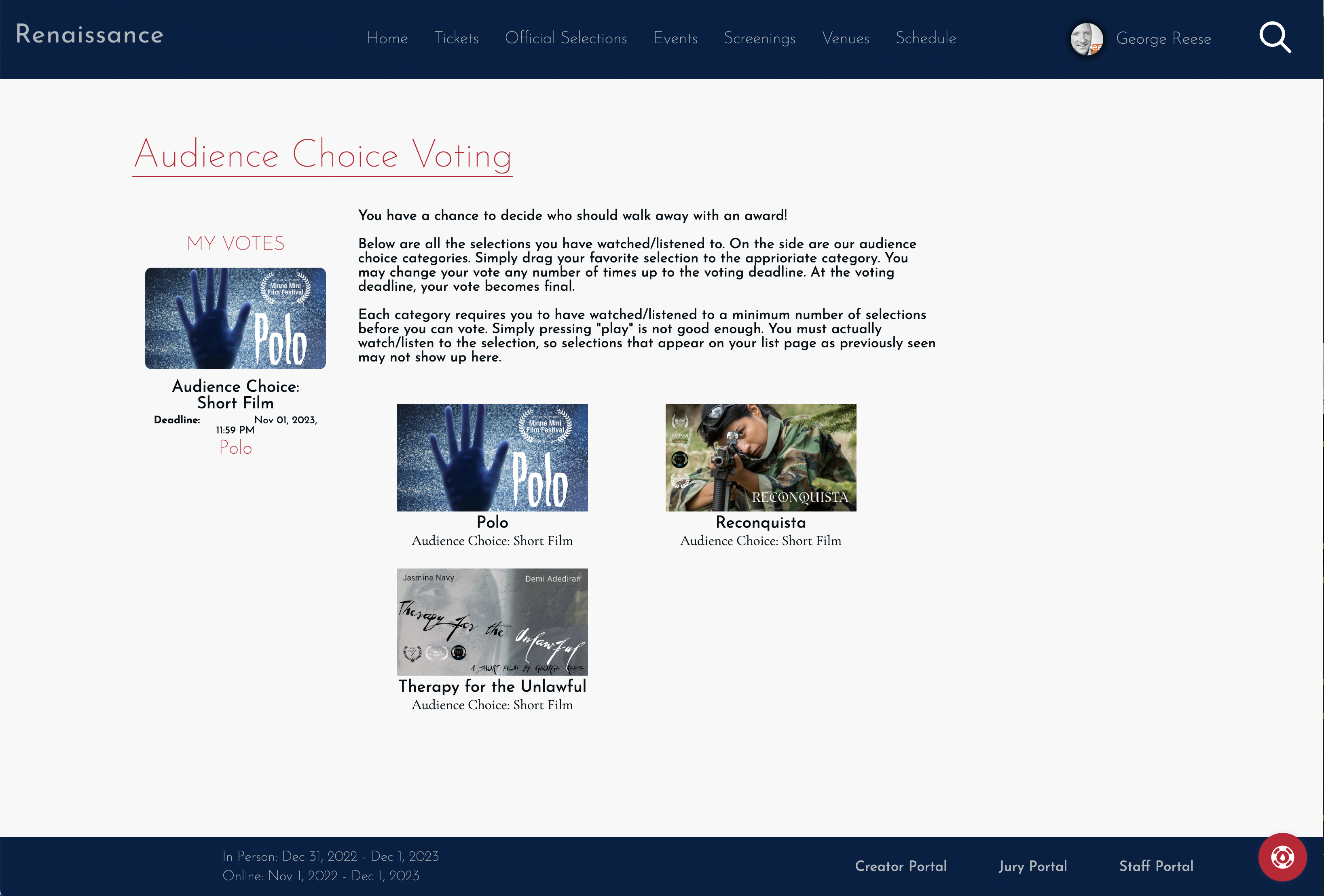
A sample audience choice voting page
The audience choice page is available only if you are using our judging module to perform audience choice voting. Though a full description of this functionality is outside the scope of this document, this page shows all of the available categories in which a viewer can vote on the left side along with all of the selections the visitor has seen (online or in-person) listed on the right side. The viewer can then drag selections from the right over to the category on the left. Viewers can alternatively click on the category and select from a list eligible selections.